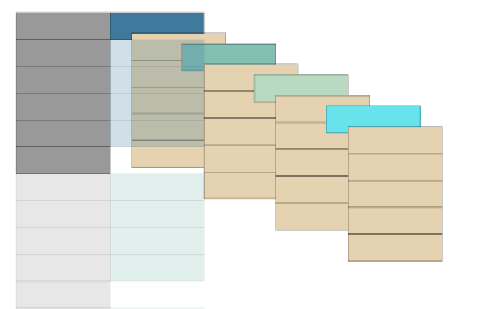
A common statistical procedure is to convert a tall dataset into a wide one, or visa versa. A tall, or “tidy” format, meets the following criteria (See https://cran.r-project.org/web/packages/tidyr/vignettes/tidy-data.html for more information):
- Each variable forms a column.
- Each observation forms a row.
- Each type of observational unit forms a table.
In this blogpost, we will outline the steps needed to create a wide-to-tall animated gif. To do so, we’ve followed and adapted a tutorial produced by Luis Verde Arregoitia here:
https://luisdva.github.io/rstats/animate-untangle/
Consider the sleep data provided by R:
glimpse(sleep)
## Observations: 20
## Variables: 3
## $ extra <dbl> 0.7, -1.6, -0.2, -1.2, -0.1, 3.4, 3.7, 0.8, 0.0, 2.0, 1....
## $ group <fct> 1, 1, 1, 1, 1, 1, 1, 1, 1, 1, 2, 2, 2, 2, 2, 2, 2, 2, 2, 2
## $ ID    <fct> 1, 2, 3, 4, 5, 6, 7, 8, 9, 10, 1, 2, 3, 4, 5, 6, 7, 8, 9...
The sleep data is already in a tidy (tall) foramt. The extra column represents the increase in hours of sleep, while the group column represents the two different drugs given. The ID variable identifies the 10 individual students that are part of this study.
We will begin by creating a slightly modified version of this data where we pretend (for sake of illustration) that there are four unique drugs rather than just two.
sleep_data <- sleep %>%
    mutate(group = as.numeric(as.character(group))) %>%
    rbind(
        sleep %>%
            mutate(group = as.numeric(as.character(group))) %>%
            mutate(group = group + 2)
    ) %>%
    group_by(group) %>%
    slice(1:5) %>%
    ungroup() %>%
    select(id = ID, key = group, value = extra) %>%
    mutate_all(funs(as.character))

glimpse(sleep_data)
## Observations: 20
## Variables: 3
## $ id    <chr> "1", "2", "3", "4", "5", "1", "2", "3", "4", "5", "1", "...
## $ key   <chr> "1", "1", "1", "1", "1", "2", "2", "2", "2", "2", "3", "...
## $ value <chr> "0.7", "-1.6", "-0.2", "-1.2", "-0.1", "1.9", "0.8", "1....
We’ve maintained the same structure of the data, but with 5 patients given 4 drugs rather than 10 patients given 2 drugs. This is for sake of making the resulting animation a bit more exciting.
Next, we create a wide version of this dataset using the tidyr spread function:
sleep_wide <- sleep_data %>%
    spread(key = key, value = value) %>%
    rename_at(vars(`1`:`4`), function(.) paste("group", .))

glimpse(sleep_wide)
## Observations: 5
## Variables: 5
## $ id        <chr> "1", "2", "3", "4", "5"
## $ `group 1` <chr> "0.7", "-1.6", "-0.2", "-1.2", "-0.1"
## $ `group 2` <chr> "1.9", "0.8", "1.1", "0.1", "-0.1"
## $ `group 3` <chr> "0.7", "-1.6", "-0.2", "-1.2", "-0.1"
## $ `group 4` <chr> "1.9", "0.8", "1.1", "0.1", "-0.1"
You can see that we’ve eliminated a column identifying the group, and instead produced four new columns, one for each of the unique drugs in our dataset. Though not strictly a tidy structure, this new format is more appealing for displaying in a table because it doesn’t repeat information on the group like the tall format does.
Now we build an animation out of it. First, we use the longDat() function to create a series of two data frames which will form the structure of the animation, where we have two datasets (a tall and a wide version). In the wide version, we create a dummy row that represents the new header of the data, which won’t be displayed in the final animation.
longDat <- function(x) {
    names(x) %>%
        rbind(x) %>%
        setNames(seq_len(ncol(x))) %>%
        mutate(row = row_number()) %>%
        tidyr::gather(column, value, -row) %>%
        mutate(column = as.integer(column)) %>%
        ungroup() %>%
        arrange(column, row)
}

long_tables <- map(list(sleep_data, sleep_wide), longDat)
Next:
long_table <- long_tables[[1]] %>%
    mutate(tstep = "a")

wide_table <- long_tables[[2]] %>%
    mutate(tstep = "b")

both_tables <- bind_rows(long_table, wide_table)
We now manually define the celltype column so that the illustrated plot produces the correct colors for each of the different types of cells:
both_tables$celltype[both_tables$column == 1] <- c(“header”, rep(“id”, 20), “header”, rep(“id”, 5)) both_tables$celltype[both_tables$column == 2] <- c(“header”, rep(1:4, each = 5), 1, rep(“data”, 5)) both_tables$celltype[both_tables$column == 3] <- c(“header”, rep(“data”, 20), 2, rep(“data”, 5)) both_tables$celltype[both_tables$column == 4] <- c(3, rep(“data”, 5)) both_tables$celltype[both_tables$column == 5] <- c(4, rep(“data”, 5))
Once we have done that, we are ready to produce static plots of both data structures using the geom_tile() function. This forms the basis for our resulting animation
base_plot <- ggplot(both_tables, aes(column, -row, fill = celltype)) +
    geom_tile(color = "black") +
    theme_void() +
    scale_fill_manual(values = c("#247ba0","#70c1b3","#b2dbbf","turquoise2", "#ead2ac", "grey60", "mistyrose3"),
                      name = "",
                      labels = c("Group 1", "Group 2", "Group 3", "Group 4", "Data", "Header", "ID"))

base_plot +
    facet_wrap(~tstep)

Finally, using the gganimate package, we create a smooth transition between the two data formats:
base_plot +
    transition_states(
        states            = tstep,
        transition_length = 1,
        state_length      = 1
    ) +
    enter_fade() +
    exit_fade() +
    ease_aes('sine-in-out')

UPDATE (1/8/2019): Due to the interest in this procedure, we’ve updated it to cover one more transformation – unnest(), a function which takes a data frame containing a list column, and expands it such that there is one row per element in the list. Below is the code and the resulting animation. Read more about this at our follow-up blog here:
